Measurement and Greenness in Software Engineering
Environmental performance is a difficult thing to pin down – especially in systems that run mostly silently, around the clock, across clouds and continents. Still, software sustainability metrics are gradually beginning to show where the energy goes. And what it costs. In numbers: compute hours, emissions per release, and power per request. The goal isn’t just measurement – it’s understanding what that measurement means when the system scales, idles, or unexpectedly misbehaves.
What to Measure and Why
Not every metric deserves attention. But some – tell us what our system is really doing. That’s where the work begins. Software sustainability metrics aren’t just about capturing data; it is about identifying patterns in energy behavior, hidden costs, and system inertia. It’s not the number of requests that matters – it’s what each one burns along the way.
A build server that sits idle for six hours a day is easy to miss. It’s not loud. It doesn’t crash. But it pulls power all the same. The same goes for continuous deployment pipelines that push out micro-releases with heavy dependencies, triggering deep test cycles each time – sometimes for changes no one will ever see.
So what should we measure?
- Power consumption per request: how much energy does one interaction consume, end to end?
- Carbon intensity per deployment: is our production process tied to clean energy – or does it spike on high-carbon grid hours?
- Idle time vs. active compute time: how much of our infrastructure sits powered but unused?
And that’s just the core. There’s also memory waste, over-provisioned VMs, and storage access loops. But even starting with the three metrics above – and watching them for a week – often reveals more than a year’s worth of code audits.
Sometimes, the system tells us what we’re missing. We just need to listen long enough.
Existing Tools and Approaches
There’s no universal toolkit for measuring greenness – and maybe that’s a good thing. Context matters. A pipeline that’s energy-efficient in one team’s workflow might be wasteful in another’s. Still, a few approaches keep coming up.
CI systems now include optional energy reports. They’re not always precise, but they show deltas – and deltas, over time, matter. Some teams plug tools like Scaphandre or Kepler into their Kubernetes clusters. Others rely on infrastructure-level reporting from cloud providers, though it’s often averaged and abstracted.
There’s also a growing culture of internal audits. One finance-sector platform logs deployment energy per team – not to rank, but to trace patterns. They found that frontend teams triggered the majority of test compute, even though their changes rarely touched server logic. The fix? Rerouting test paths and caching unchanged modules.
Another approach is simulation. Before rolling out a change, we can use trace-based modeling to predict impact. It’s not perfect – nothing is – but it’s better than finding out after rollout that a config tweak doubled runtime.
No tool answers everything. But most bad patterns show up when we ask the right questions.
Common Pitfalls and How to Avoid Them
We tend to start with the obvious – and sometimes that’s the first mistake. Tracking the wrong metric is bad. But tracking the right one in the wrong context?
That’s harder to catch. Take deployment energy, for example. It sounds solid – until your team moves from weekly to hourly pushes. Without normalizing the data, metrics spiral. Efficiency per unit might improve, yet the chart still paints a worse picture. That’s noise, not signal.
Another misstep is optimizing without checking back. We speed up build times by switching frameworks, then celebrate. But if compile-time energy goes up? That trade-off’s not so simple anymore.
And then there’s the dashboard effect. Bright visuals, color-coded graphs, and scores that feel official. One team noticed their “green index” jumped after silencing logs. Looked like progress. But the logs were just routed elsewhere – the power still burned, just under someone else’s meter.
So what actually helps?
- Ground every measurement in actual usage. No context, no clarity.
- Pay attention to when things run. Carbon cost depends on timing.
- Blend what’s technical with what’s human: who triggers builds, how often, and under what pressure.
And if we can’t explain a metric in one sentence – maybe we’re not ready to act on it yet.
Tracking the Hidden Carbon in Code
No one writes code thinking, “Let’s waste power.” But inefficiency sneaks in – through legacy decisions, default settings, and invisible costs. Some processes might seem minor — a five-second test repeated hundreds of times, a container left running overnight without doing anything useful, a service launched just to return “nothing’s changed.” These micro-habits become carbon habits.
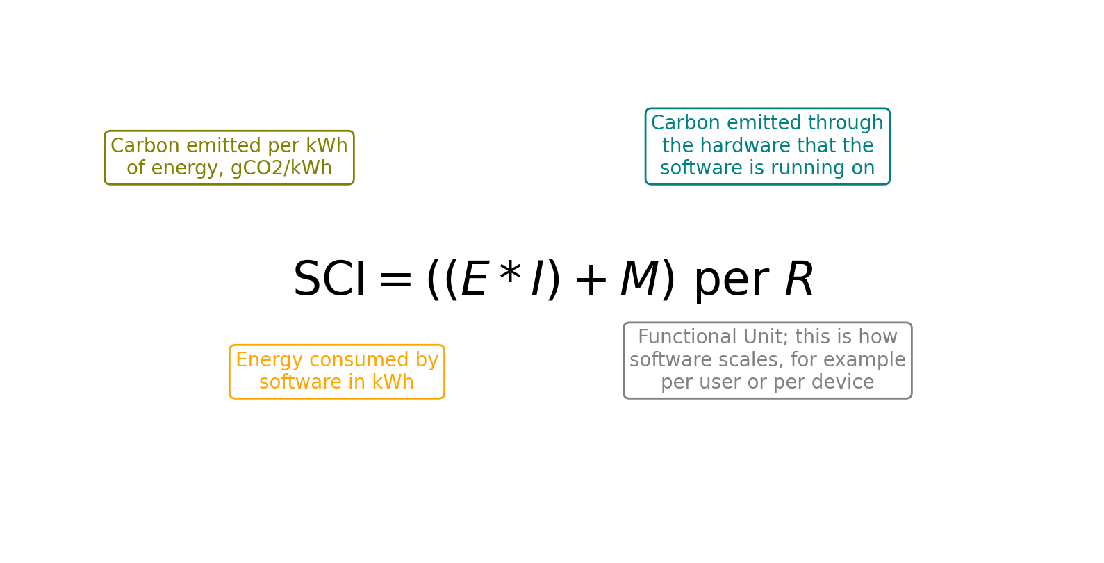
Measuring helps surface these patterns. But total emissions alone don’t tell the whole story. To understand where this “hidden” carbon comes from, there’s a metric called Software Carbon Intensity (SCI). It reveals which parts of your code generate emissions — and makes them measurable. Instead of calculating absolute tonnes, SCI captures how much carbon a task produces – per user, per API call, per functional unit.
But identifying the issue isn’t the same as solving it. You can’t lower your SCI score by buying offsets or renewable energy certificates. What’s needed is a change in how the system works — in the code, the infrastructure, and the processes that drive it.
That’s really the core message. Systems behave the way they’re designed. Code, like people, develops habits. And humans have the power to change them — once they recognize why it is so important. SCI gives us a way to track that progress.